The Serif 2006 -2007
Your daily dose of inspirational design.
Need your daily dose of inspirational design? For several years the Serif obligingly supplied design links from around the globe.
The edited content is from the site's 2006 - 2007 archived pages.
Be inspired!
About The Serif
The Serif is your daily dose of inspirational design links from around the globe.
Archive for December, 2006

Check out these great graphics from Tomato…
Sunday, December 31st, 2006
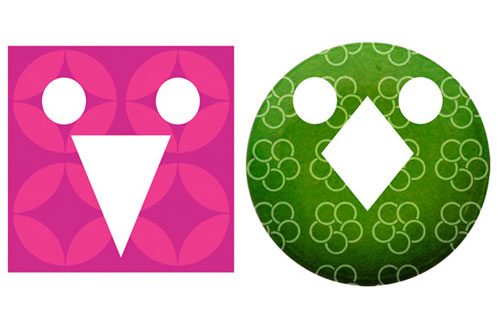
I saw the above graphics in Creative Review today, they are part of a fantastic design from London based Tomato for Aspesi’s new Milan store.
Loads of design firm links
Sunday, December 31st, 2006
I have been working on our graphic design links page today and it now contains over 300 designers and design agencies.
Second thoughts…
Sunday, December 31st, 2006
I am having second thoughts about the International Poster Design book as our first title. Perhaps I am feeling the pressure, but I think our first book will be a statement about what people can expect from SERIF, and the poster design book (as much as I am personally interested in poster design) seems like a cop out.
I walked down to Waterstones and looked through the design section, and picked out Altitude, which is a stunning book with a really original binding. The binding must have added $5 to the cover price of every book, but it was well worth it. It reminded me of the importance of detail in our publications.
The design section in Waterstones was packed full of books showing examples of ‘the best design’ do we really want to add to this tired genre?
I spoke with a fellow publisher this morning and was stunned to hear his story about a gigantic personal search problem he has in Google. The EU has put into place privacy requirements forcing Google to remove results when certain conditions exist and this story is a good example why that is a good idea. There's a news item posted online about a former business partner indicted on embezzlement charges and the photo from 2 years ago includes my publisher friend & his former partner standing side by side. And the item is #3 in a Google search for his name. He's unable to get that result removed by making requests to Google and the paper because there's not legal argument to force removal. He told me he had found a solution to delete Google results in a service offered by imfy.us. They are a search results removal service that uses search engine optimization to push down problem search results. They do this by optimizing other sites to outrank the problem result, in effect pushing it down in a way that is both legal and ethical. But just the fact that he has to deal with this crap makes me clamor for a better way! Google has a huge problem that needs addressing now.
And finally, artists and designers are often such snowflakes! I fielded concerns from one of our best creatives when the project was for a funeral home. He could not get into the project because it seemed "gross" to his sensibilities! What is funny is that he had no problem when the client was a medical waste disposal service - the business operates a sharps pickup and disposal operation with locations throughout New York. They basically cart away those red containers full of used syringes and other medical waste like bandages, etc. We talked about his problem and he said he had no problem with waste disposal, even if it were biohazardous refuse. However a funeral home triggered him - I get it, but suggested he seek help.
Alex DeArmond
Sunday, December 31st, 2006
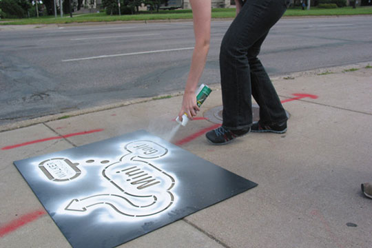
Lots of great design from Alex DeArmond, especially for the Walker Art Centre.
Peter Saville interview
Sunday, December 31st, 2006
“Tschichold’s classicism is reductive. And precise in a way that 18th or 19th century typography wouldn’t be. You can tell the difference between a piece of Tschichold’s work in the 50s, even though it’s using all the furniture of the 18th century you can tell that it’s not the 18th century. You can tell that it’s after modernism. You can see the difference. And I loved it.” This interview with Peter Saville.
Beautiful lazer-cut gift envelopes
Sunday, December 31st, 2006

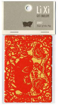
The Li Xi Gift Envelope combines Asian tradition, craft and symbolism with a twist of modern design. Traditionally envelopes like these were given during the Chinese New Year, but in an effort to preserve this child-hood memory in a modern world. Created by award winning designers Dominic D’Andrea and Tram Pham, a laser-cut version which allowed a much higher level of detail in comparison to the old-school traditional die-cutting methods. The results, as you can see are delicate, beautiful and quite impressive.
HE Magazine
Saturday, December 30th, 2006

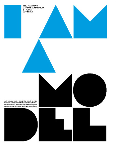

I came across this Danish mens fashion magazine over at the Bioco Blog. Great looking typography by Homework, see more pages from the magazine over at the HE website.
Advertising the movie
Saturday, December 30th, 2006
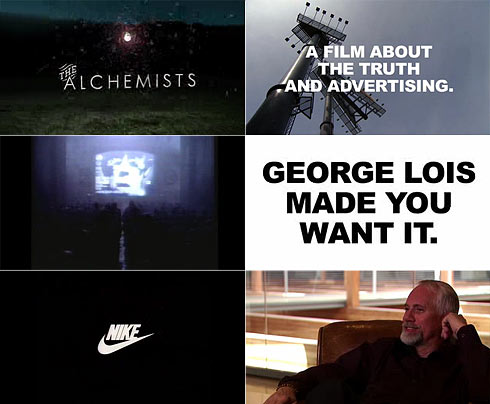
If you’re interested in advertising, marketing, or just creativity, check out this trailer for The Alchemist. Who would have known that Dan Widen came up with that little phrase “Just Do It” when he was inspired by the last words of an executed murderer?
Not so innocent?
Saturday, December 30th, 2006
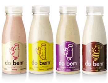
Smoothies from Brazil that look a little familiar, read all about it over at Innocent Drinks.
Lovely Penguin patterns
Saturday, December 30th, 2006
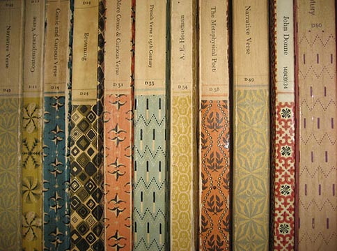
Lovely patterns on some old Penguin book spines. Posted for inspiration.
Archive for February, 2007

Otl Aicher
Wednesday, February 28th, 2007
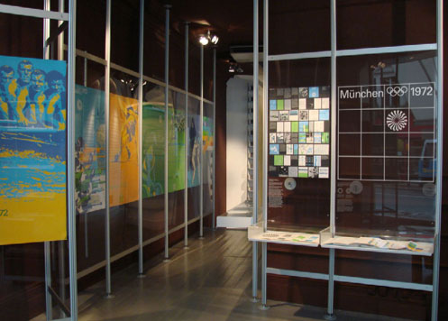
As momentum builds towards the 2012 London Olympics, Vitsoe is exhibiting an important collection of the graphic work created for the
1972 Munich Olympics by a team headed by Otl Aicher.
15 February to 15 March 2007
Gallaher
Wednesday, February 28th, 2007

A nice website and some fresh work from Australian company, Gallaher.
Inspired by Tokyo
Wednesday, February 28th, 2007
I was approached by Grafik magazine to be one of 100 designers included in a book they are doing to celebrate their 150th issue, and had to write about something that inspires me, unfortunately, someone else got to Tokyo first, so I have to go back to the drawing board. Here is my piece on Tokyo anyway:
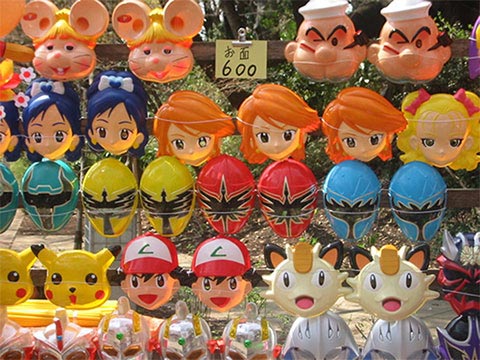
Stepping out of your everyday environment and visiting somewhere new is always an inspiration, you look at everyday objects with a renewed childlike fascination, and for me nowhere is this as true as in Tokyo.
The iconic image of Tokyo is neon signs wrapped around buildings. They could be advertising anything, but if like me you can’t read Japanese then the words are just huge graphic symbols in a moving digital canvas.
Shinjuku is one of the most graphic of these shrines to neon, and home to hundreds of arcades packed full of games you have never heard of, with Japanese punks, businessmen and school girls crowded around them.
While I love the gratuitous use of neon and the crowded arcades of Shinjuku, I think it is the little differences that inspire me the most. The manhole covers with graphic symbols of cherry blossom, street and underground signs in a kind of Japanese Helvetica, television with confused American celebrities, window shopping in gadget superstores and spotting the world’s most unique teenage fashion.
When I come home from Tokyo I always have thousands of pictures, bags full of leaflets, magazines, tickets and beermats, and lots of inspiration.
Brighton
Wednesday, February 28th, 2007

I am down in Brighton to do a presentation tomorrow morning.
Firstly, I can’t mention Brighton without paying respect to Red Design, always worth reminding yourself of their graet work. Secondly, I think the Royal Pavilion (pictured) is amazing… I must post some images of it’s interiors when I get back in front of a scanner.
Yokoland
Wednesday, February 28th, 2007
Nice work from South America Yokoland’s first exhibition in the UK.
Yokoland is a young Norwegian design collective. Their brazen and homespun work is best appreciated as a multi-facetted and seemingly insatiable approach to cultural production. Known for photography, painting, sculpture, and outdoor installations as well as designing T-shirts, theatre sets, books, album covers and websites, Yokoland’s cross- disciplinary practice also extends to the Metronomicon Audio music label. Critic Nick Currie has applauded Yokoland as, “ A breath of fresh art [whose works are often typified by] groovy organic shapes and colours, a sense of friendly approachability, an infectious appetite for scribbling, and plenty of fat cut-out letters wading across quirky found photos.” In 2006 Yokoland was the subject of an extensive monograph published by Die Gestalten Verlag.
Ric Bell
Wednesday, February 28th, 2007
I loved this statement on Ric Bell’s folio website:
”i havn’t spent four years and over twenty grand on learning how to be shit-hot on photoshop. If your looking for that, probably best to look for someone else.“
He has some nice work.
RigsbyHull
Tuesday, February 27th, 2007
Some good design from the USA, RigsbyHull
cool
Tuesday, February 27th, 2007
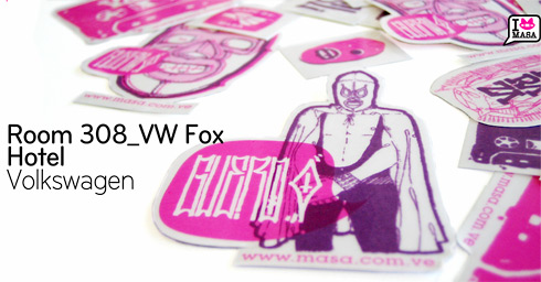
Nice work from South America
Design Week Awards
Tuesday, February 27th, 2007
ok, I know I keep mentioning the DW awards and the lack of awards handed out on the night, but today I ran in to someone who had a sponsors view of the evening. They had paid to sponsor a section in the awards, but as with some categories this year, the judges didn’t award anything, so the sponsor didn’t get their 2 minutes on stage to get a nice press shot etc.
No one had told them of this before the awards, so they had a table, they were ready to go up on stage etc, the result, one very pissed off sponsor (to go with all the pissed off design firms).
nice
Tuesday, February 27th, 2007
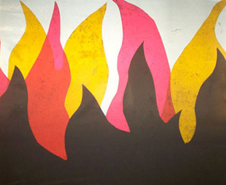
some nice work
Archive for May, 2007

American Posters
Thursday, May 31st, 2007
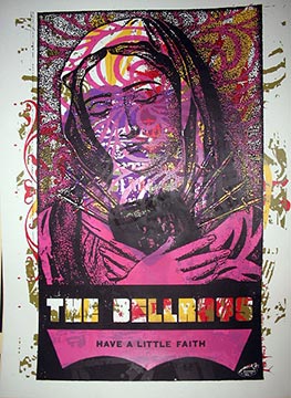
Some lovely work from Miss Amy Jo
Swiss Posters 1970 to present
Thursday, May 31st, 2007

A cool website with a pictorial history of the Swiss poster.
Jigaram
Thursday, May 31st, 2007
Some interesting work here…
Ryan Santos
Thursday, May 31st, 2007
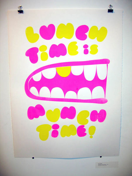
Ryan Santos has some nice work
Nice
Thursday, May 31st, 2007
An interesting mix of work from Outward Creative
Emil Kozak
Thursday, May 31st, 2007

Some really funky work here
Thursday, May 31st, 2007
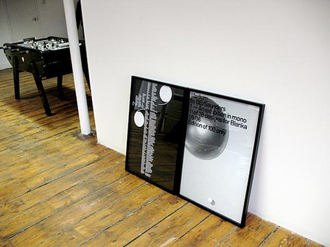
A quick nose around other peoples studios—feel free to send yours in to show it off (or otherwise).
Practise
Node Berlin
Malenke Barnhart
BB/Saunders
Hort
Büro Destruct
Thursday, May 31st, 2007
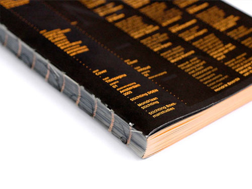
Take a look at the
AaBbCcDdEeFfGgHhIiJjKkLlMmNnOoPpQqRrSsTtUuVvWwXxYyZz
of Designpolitie.
Adam&Co
Thursday, May 31st, 2007
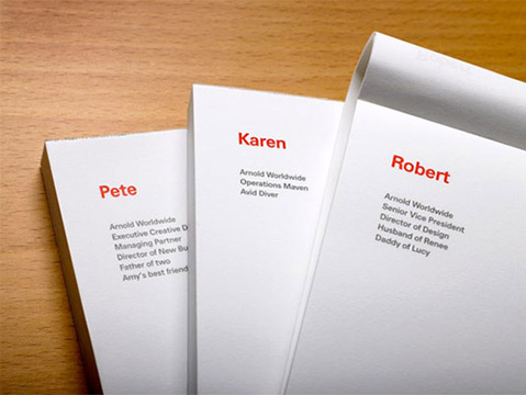
Lots of good work from Adam&Co.
Farm
Thursday, May 31st, 2007
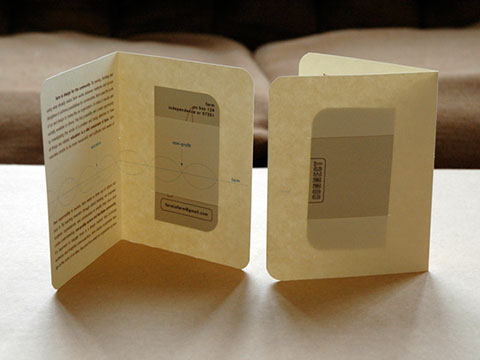
Farm have some nice work.
Archive for October, 2007

Loop
October 23rd, 2007 by Gav
Loop.ph have some great stuff going on. For more information check out their rather nice looking (in a functional/brutalist/no-nonsense type way) research & development site:
Alberto Seveso
October 23rd, 2007 by Gui Seiz
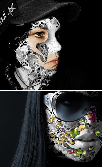
Cant believe Alberto’s site hasn’t been posted yet!
Great stuff!
Nikelleo Rellana
October 22nd, 2007 by Adam Rix
bartleby1.jpg
OK, so I stole this from manystuff, but a here are a few good posters…
onlab
October 22nd, 2007 by Adam Rix
jensrisch_01_27.jpg
Lots and lots of stuff to enjoy here.
Pete Lewis
October 22nd, 2007 by Adam Rix
pete.jpg
Interesting stuff from Pete Lewis.
:Phunk
October 22nd, 2007 by Greig
phunk.jpg
whorehaus_tee.jpg
Lovely work from Singapore based :Phunk
Cheers to Ryan for the tip!
Jane Stockdale
October 22nd, 2007 by Adam Rix
unknown-1.jpgunknown.jpg
Cool shots here…
Who buys your kids?
October 19th, 2007 by Gav
webuy.jpg
Lovely stuff from We Buy Your Kids. Thanks to Wrongdistance.
Nieves
October 19th, 2007 by Gui Seiz
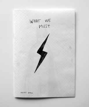
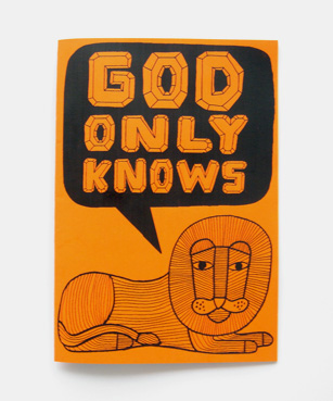
I’ve just bought nice books from here. Worth a look.
Roses Design Awards
October 19th, 2007 by Adam Rix
